Digital Package Leaflets
A design concept for digital package leaflets in the style of the BfArM
Digitizing package leaflets supports the redistribution of medicine across EU markets during shortages, as information can be quickly updated and translated into multiple languages. It improves accessibility by allowing content to be adapted to individual needs and ensures that product changes or safety warnings are communicated quickly
design decisions
The BfArM
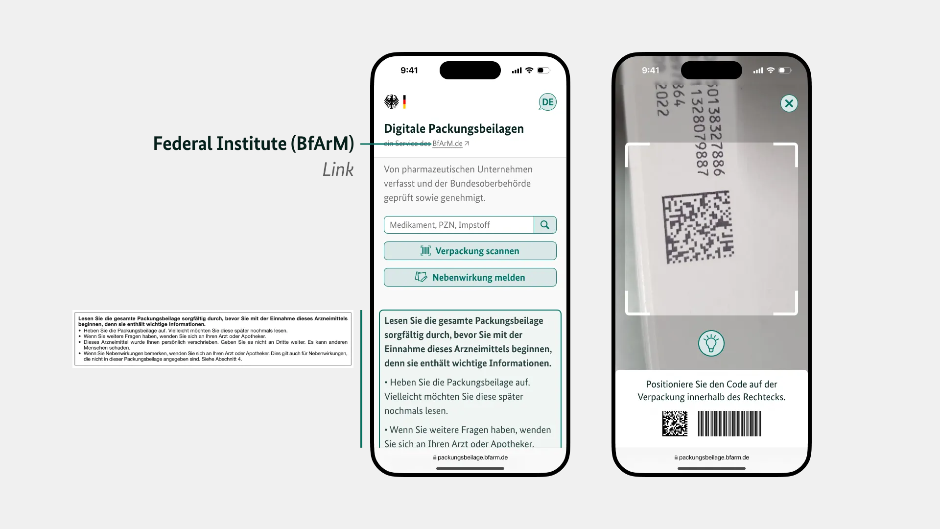
The Federal Institute for Drugs and Medical Devices (BfArM) is responsible for the approval and registration of drugs, their safety, as well as the risk assessment and evaluation of medical devices. For this reason, I have considered them to be also responsible for the official and trustworthy publication of the package leaflets in this project.
A possible subdomain for this project would be:

Readability
In 2009, the EU published a guide to the legibility of package leaflets, which includes guidelines on font type and size, pictograms, and layout.
Some of the EU guidelines are:
- Similar letters/numbers such as “i,” “l,” and “1” must be easily distinguishable from each other.
- Italics and underlining make it difficult to recognize the shape of words and should therefore not be used.
- No justified text.
- Line spacing should ideally be 1.5 times the distance between words in a line.
- Clear separation of the different sections (e.g., by lines) helps with navigation.
- Pictograms should not replace text, but should only support navigation or clarify aspects of the text. If necessary, proof that the meaning is generally understood is required.
A prerequisite for approval is the readability test, in which test subjects are presented with the package leaflet. For the test to be considered passed, 80% of the required information must be found and understood quickly.
Font Choice
Since BundesSans is the official font of the German federal government and complies with the recommendations of the DBSV regarding legibility, I considered it suitable for this project.
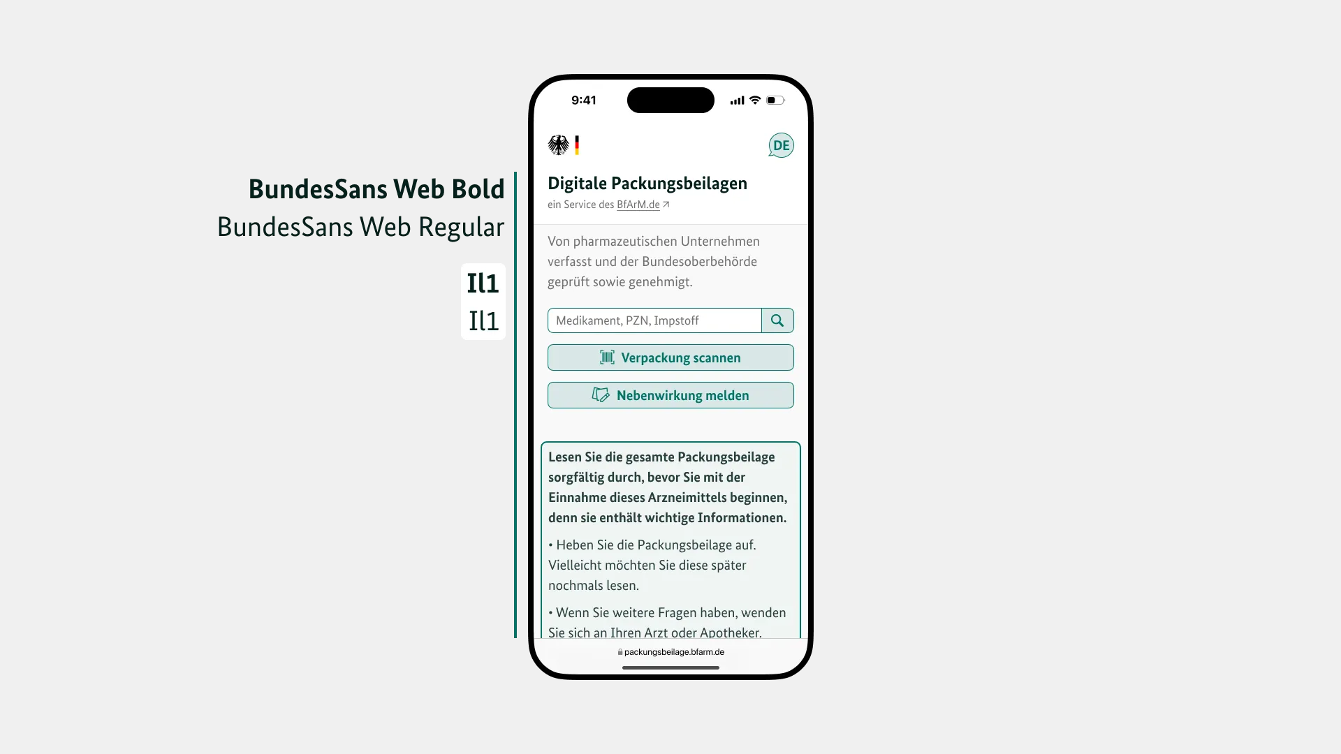
BundesSans
concept
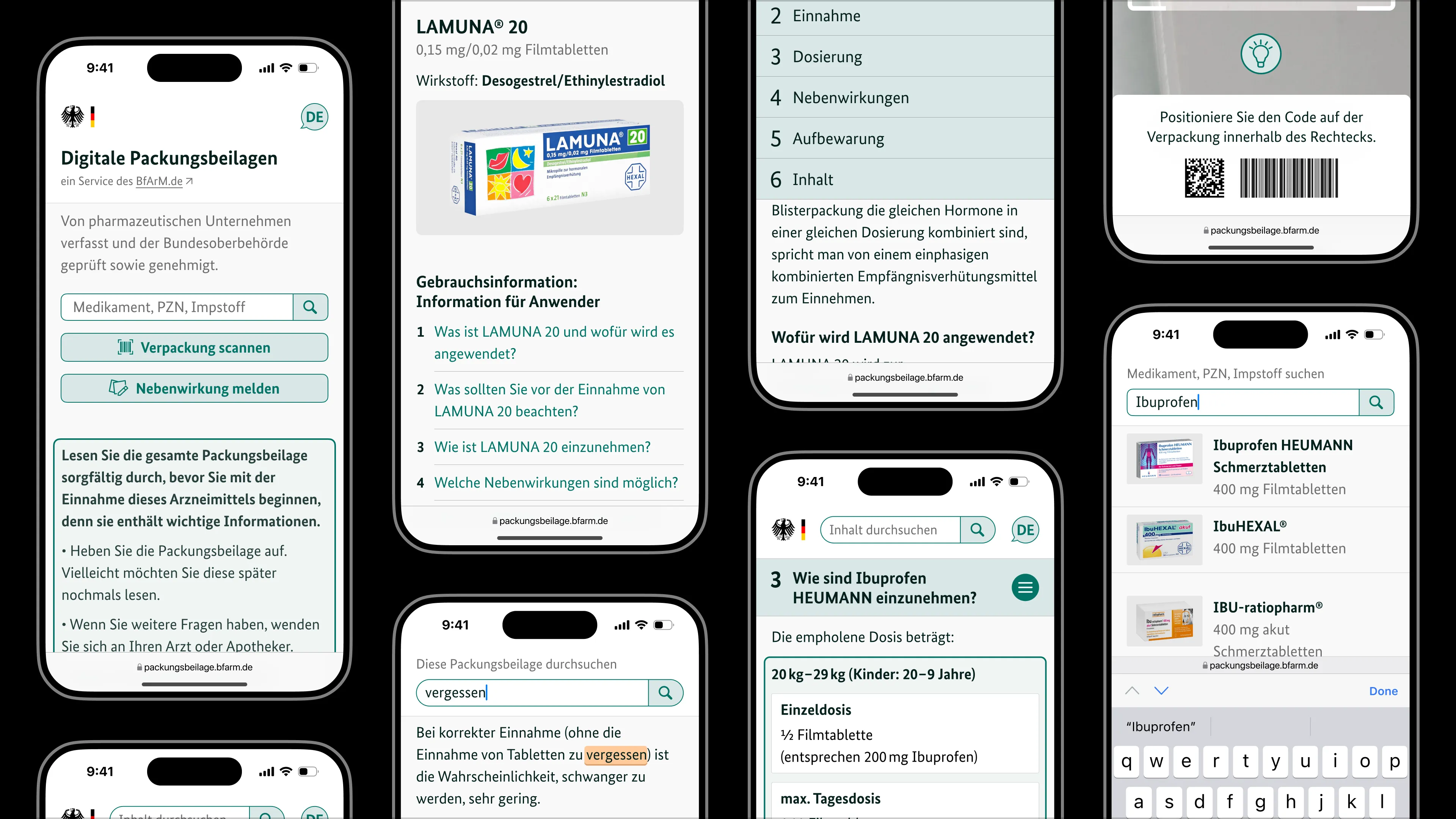
Home Page
On the home page, users can search for medicines, scan packaging, and report side effects. Below these options is a note that is normally found at the beginning of every package leaflet. To make it clear that this is an official service, there is a link to the responsible federal institute.
Structure
Each package leaflet consists of the same six sections.
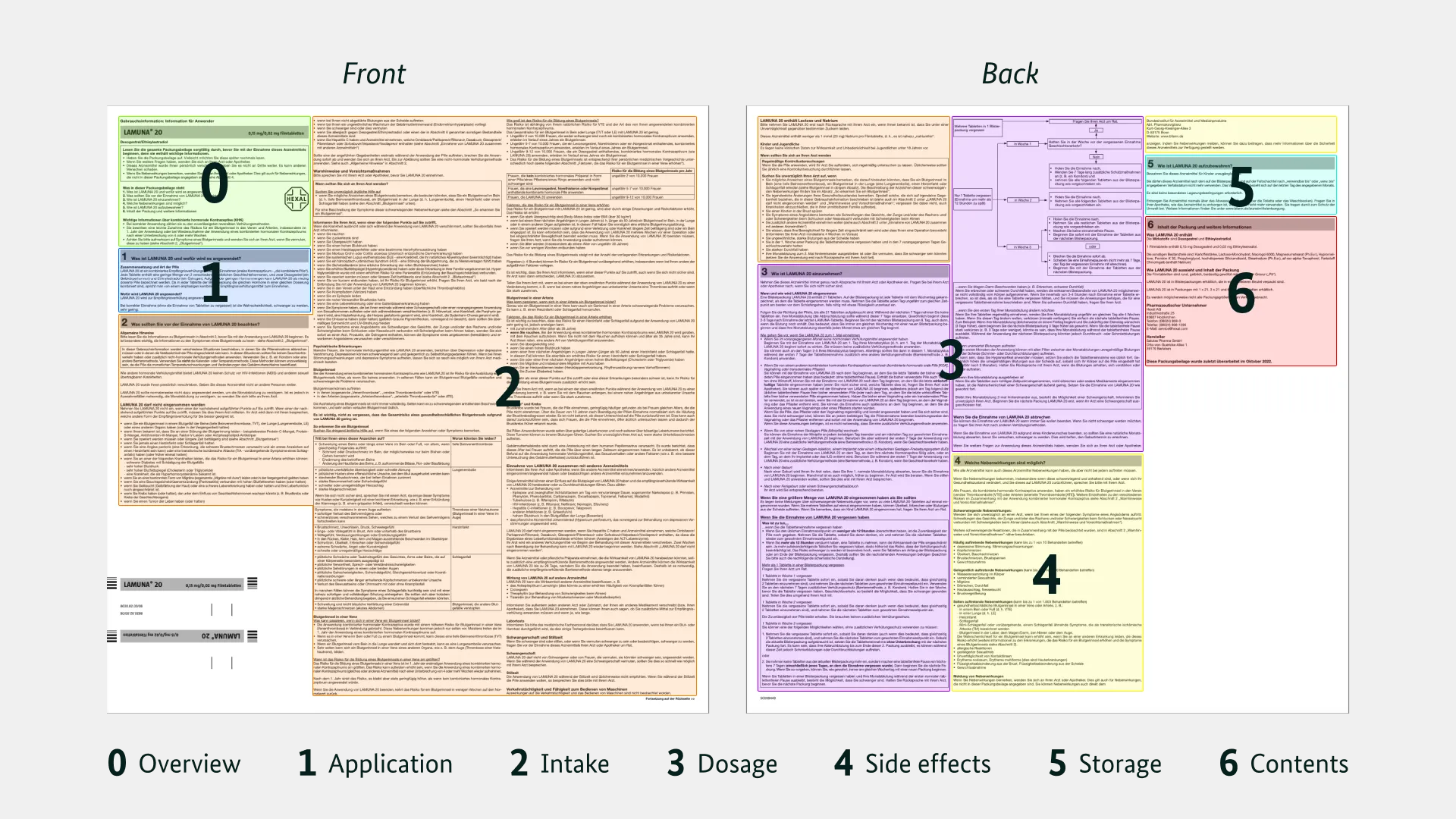
Sections of a package leaflet
I have transferred these sections to the digital format and made them easy to find using anchor links.
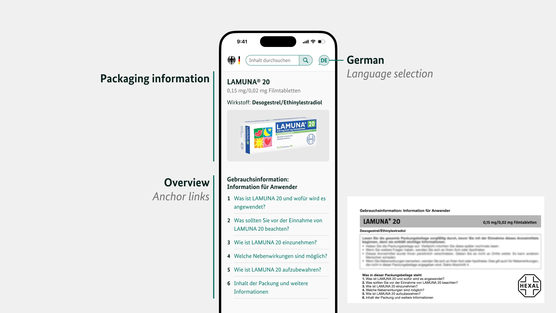
Sections in the digital package leaflet
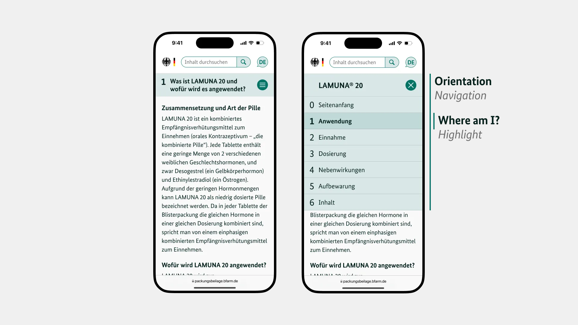
Orientation
It is important to me that the text can be read in one go, but also that the user does not lose their orientation. That is why each title of the six sections sticks to the top as soon as you scroll past it. It also allows users to navigate through the sections.
Contents
A package insert consists of various elements: title, continuous text, lists, references to other sections (here with anchor links), highlights, tables, etc.
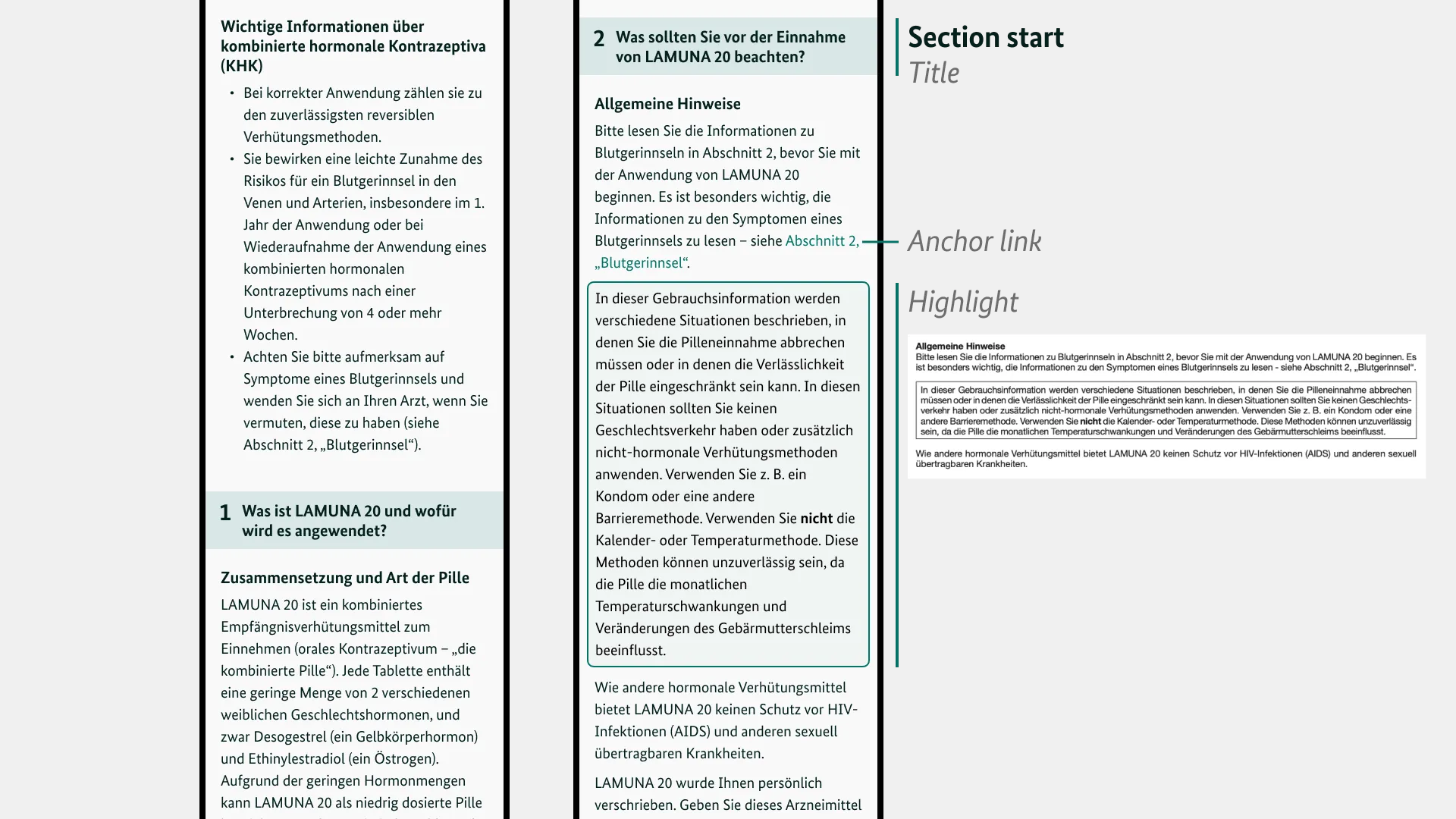
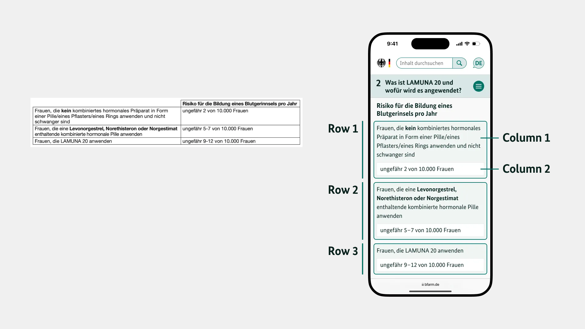
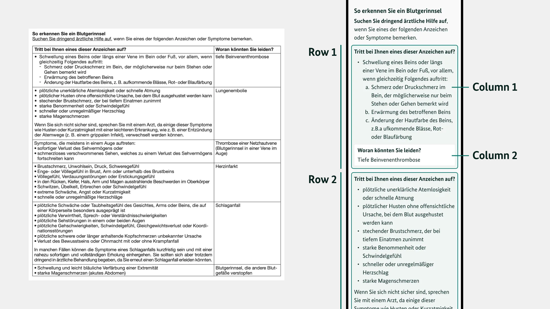
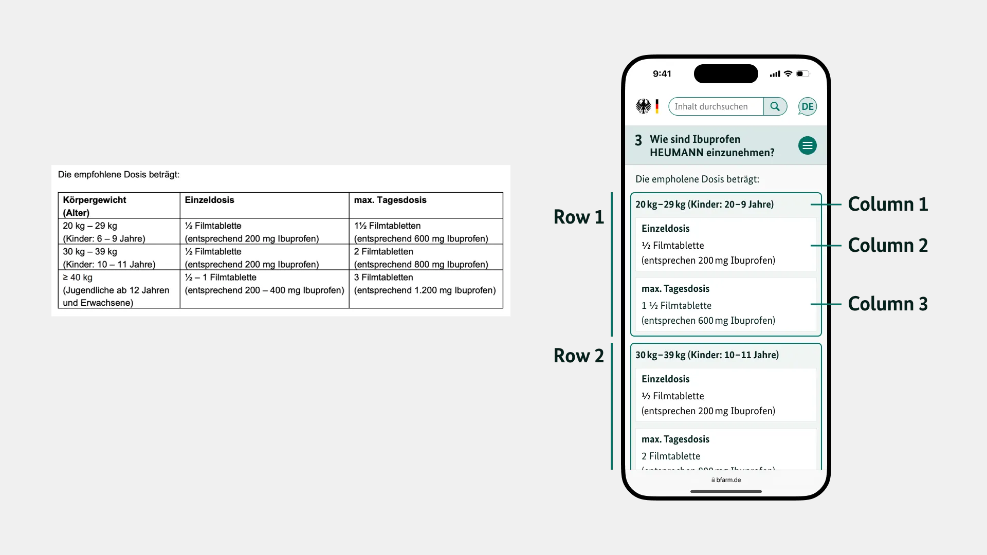
Table Layout
Tables often appear in package leaflets in all kinds of sizes. That’s why I tried to find a solution that also works on small displays. Any table can be incorporated into the layout I chose, regardless of how many columns, rows, or how much text it contains.


Search Function
Search Package Leaflet
A small survey of my peers revealed that almost no one knows how to search a mobile browser page. However, since this is an essential advantage of a digital package leaflet, my concept offers this feature through the site itself.
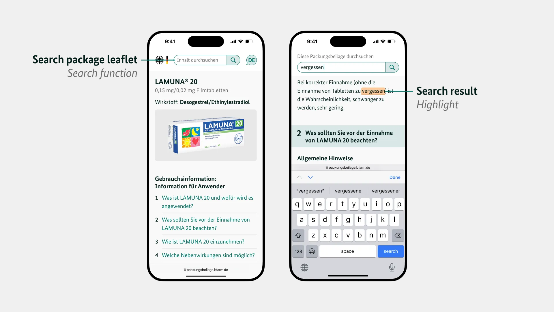
Search function: Content
Search for Medication, PZN, Vaccine
The search for medicines on the home page is independent of the search within a package leaflet. This can be recognized by the slightly different shape of the search bar, but above all by the clear, high-contrast labeling.
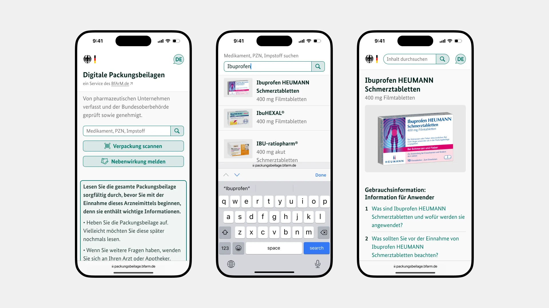
Search function: Medicine