Navigating Adaptivity
A Design Exploration of Adaptive User Interfaces for Public Transportation Apps
Modern human-machine interfaces are moving beyond one-size-fits-most solutions by incorporating artificial intelligence to personalize user experiences based on human behavior and context
adaptive user interfaces
Most Interfaces are One-Size-Fits-Most Solutions
Most of the interfaces we use every day try to make one interface work for as many users as possible. They offer one mode of use, and one way of interacting—regardless of the variety of habits, contexts, or needs people might have. But people aren’t the same and we also change—across time, tasks, locations, moods, and abilities. So what if user interface were to change their behavior, appearance, or content in response to a user and their situation?
This isn’t a new concept, it’s a topic that has been researched for decades. Some systems already adapt through simple rules, and some already use more advanced approaches like AI. This type of interface is called Adaptive User Interface (AUI) and has been defined as:

Definition of Adaptive User Interfaces (AUI)
exemplary use cases
What if your public transport app knew you?
I explored what adaptivity could look like in an everyday scenario: Public transportation.
Public transportation apps cater to a diverse range of users with varying needs. For instance, daily commuters, tourists, people of different age groups, and individuals with disabilities all bring unique preferences, mobility challenges, time constraints, and situational contexts.
This case study explores how user interfaces can dynamically adapt to different contexts within a public transport app. The aim is to explore and illustrate practical examples of adaptive UI behavior—not to redesign an existing application, but to show conceptually how interfaces can respond to factors such as user needs and environment.
Foundational Interface
The UI screens presented in this exploration are not based on a specific, existing application. However, the visual language and components used follow Apple’s Human Interface Guidelines (HIG), including system fonts, icons and native UI elements. This choice was made to ensure visual clarity and consistency.
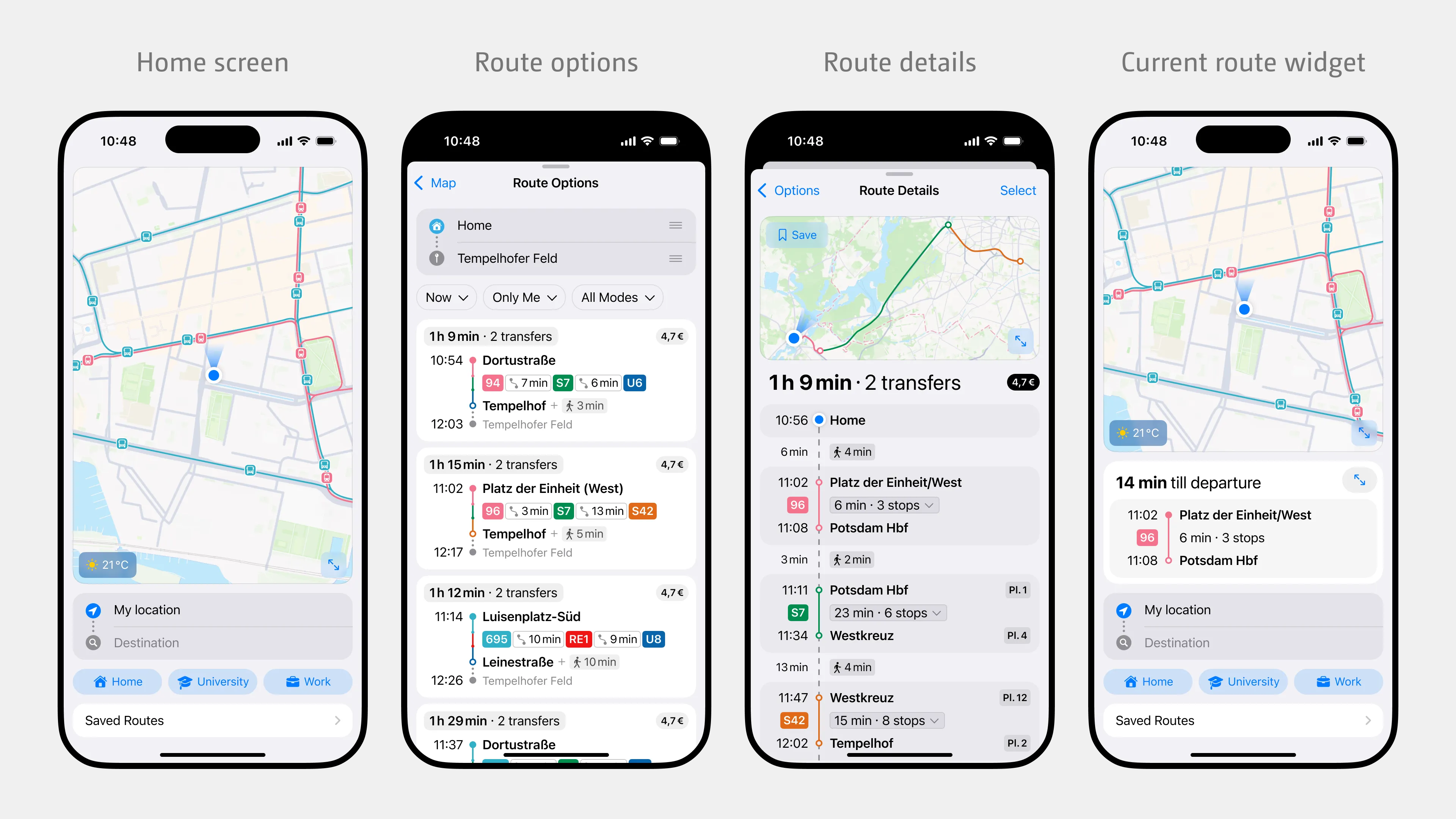
The design goal was to provide users with the information they needed to make an informed decision, without having to repeatedly navigate between multiple route details pages.
Long-Distance Connections
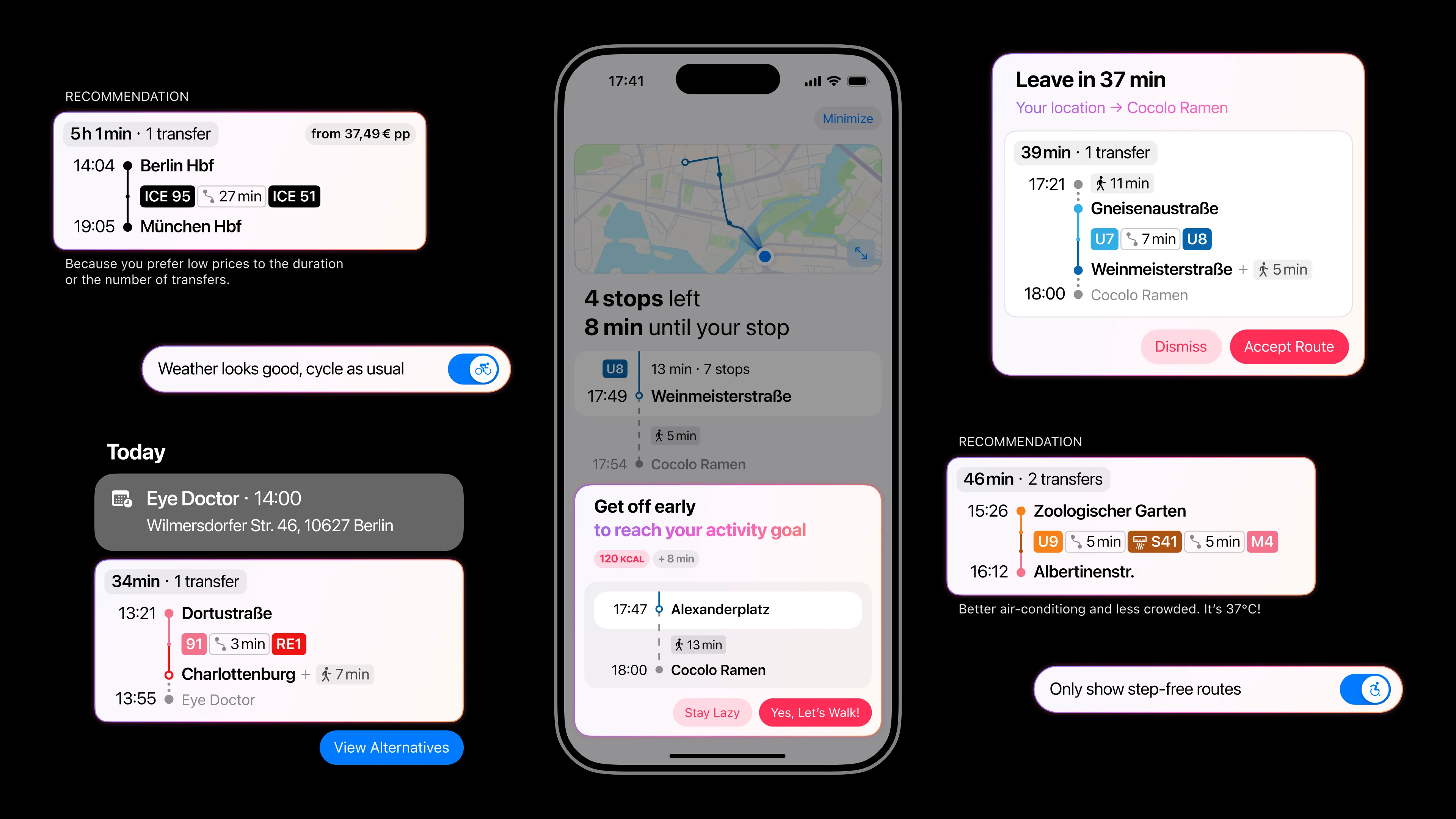
User needs differ when traveling long-distance compared to traveling locally. Long-distance trips are often planned in advance, and users may prioritize differing factors, such as price instead of duration, since long-distance trips can be significantly more expensive. When searching for a destination far from the user’s current location, the user can enter more specific trip details, such as a departure date or point of origin, before searching.
In this scenario, the user needs a ticket, so the resulting route options have price tags. The user is also prompted with a route recommendation based on the system’s calculation of the route most likely to be chosen based on past interactions.
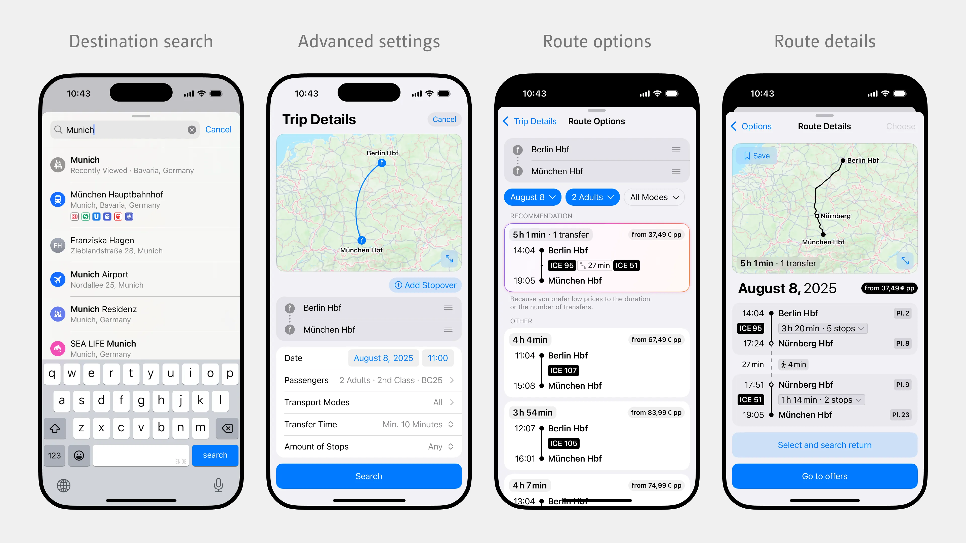
After selecting a route, users can access ticket offers on the Route Details page. This option appears if the user does not have a ticket for that route, just as price tags appear. Users can also search for a return trip before purchasing a ticket.
Transfer
When transferring between lines, a user’s confidence can vary based on their familiarity with the route and station. The screen on the left shows the in-vehicle route view seen by the user while traveling on public transport and before exiting to change vehicles. To facilitate confident and efficient transfers, the UI dynamically adjusts the type and amount of information displayed according to the user’s presumed familiarity.
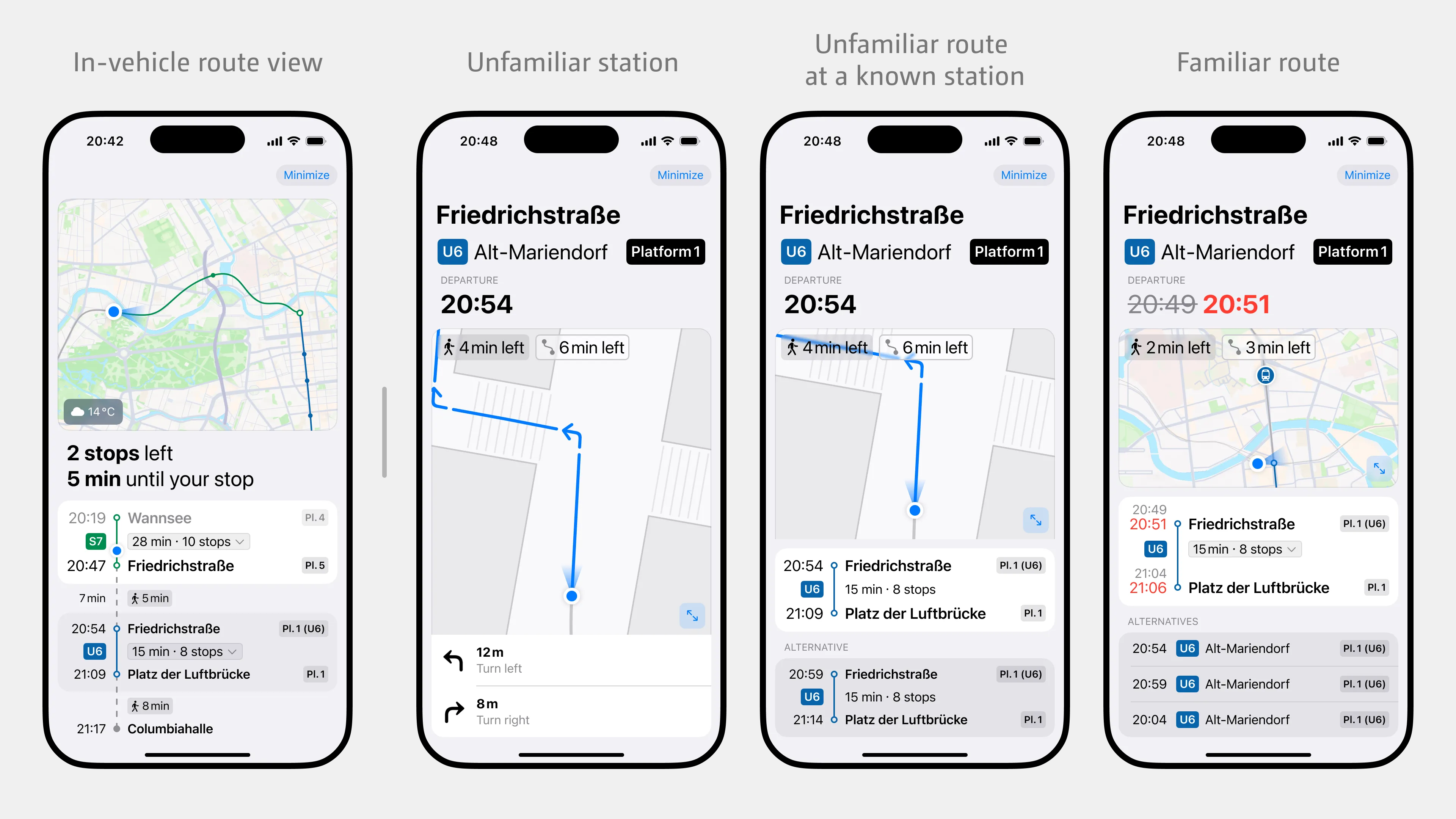
To mitigate the cognitive burden of the transition from the in-vehicle route view to the transfer-focused view, the UI shift is timed to coincide with the moment users physically get off to change lines. While this is a significant visual change, previously presented research shows that adaptations introduced during physical activity shifts—such as standing up or exiting the vehicle—are less likely to be perceived as disruptive.
Cultures and Personalities
Users’ cultural background can shape how they perceive and interact with user interfaces. Language and reading direction are among the most straightforward adaptations a system can make and are often automatically configured through the operating system’s settings. This makes it relatively easy to provide support for languages like Arabic with a right-to-left (RTL) layout.
More complex to interpret are the subtle influences of users’ personalities and the cultural norms that shape their expectations and behaviors, and decision-making. The examples shown here contrast two types of users: one who values flexibility and the freedom to adjust plans spontaneously, and one who prefers structure, predictability, and detailed guidance throughout the journey.
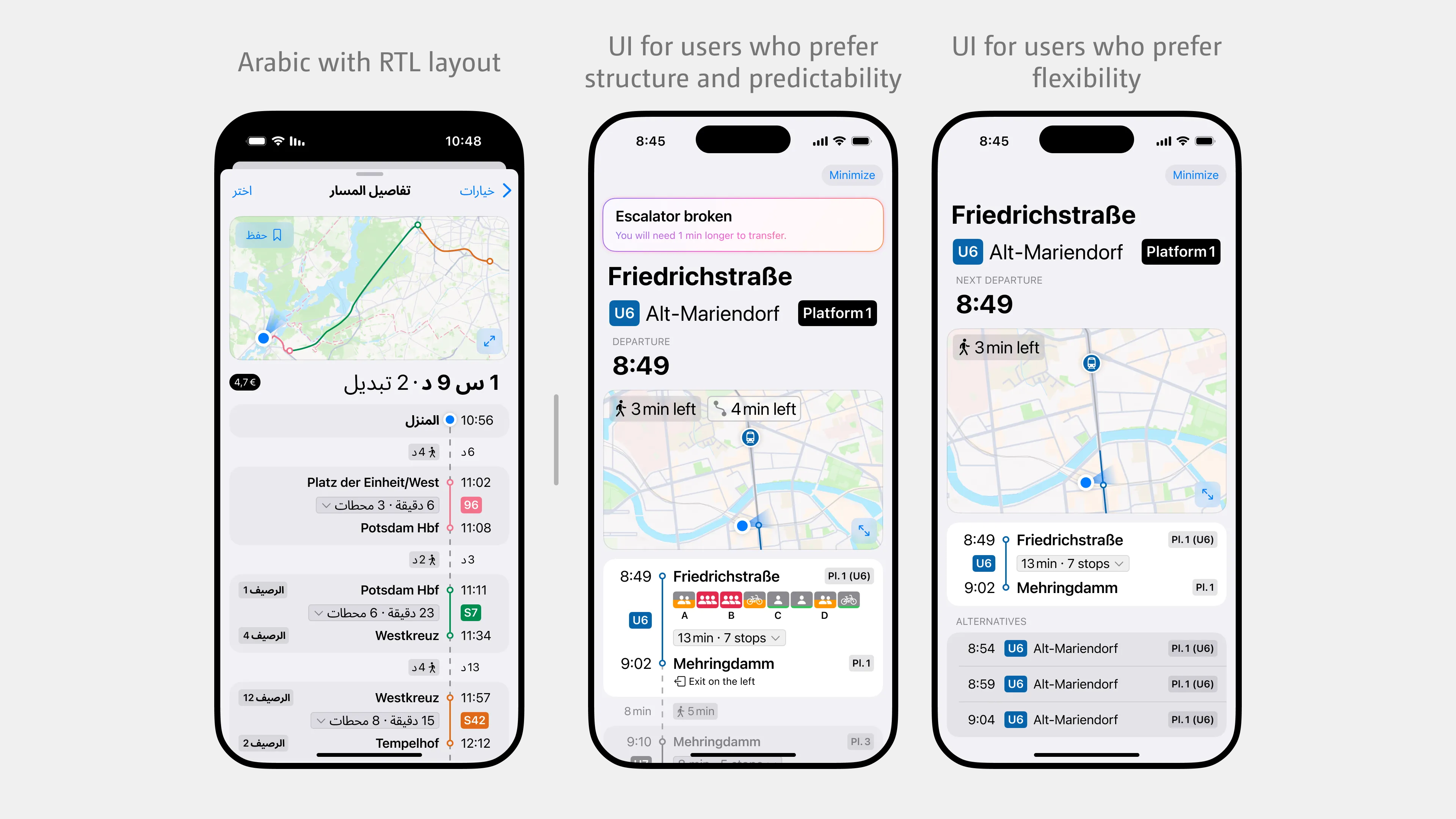
Designing for cultural diversity requires more than a simple translation or localization:

Children Taking Public Transport
Designing for children requires considering how their cognitive, physical, and developmental differ from adults. Children generally have different requirements for a UI. A few principles that have been incorporated into this concept are: Simple instructions, straightforward navigation, and large, noticeable touch targets.
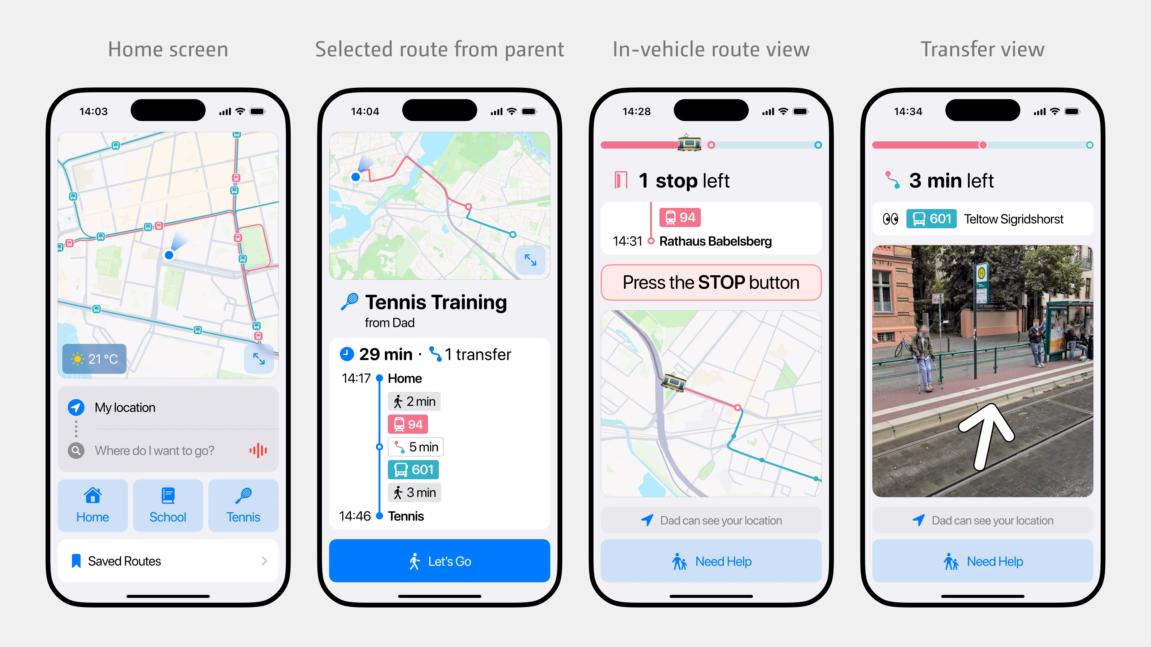
Parents/guardians can send selected routes directly to the child’s phone. The child is then guided step-by-step through the entire journey.
Children are highly sensitive to designs targeted at specific age groups and tend to react negatively if the content does not match their developmental stage. Therefore, when systems are adaptive to young users, it is crucial to accurately match their cognitive and emotional development to avoid frustration.
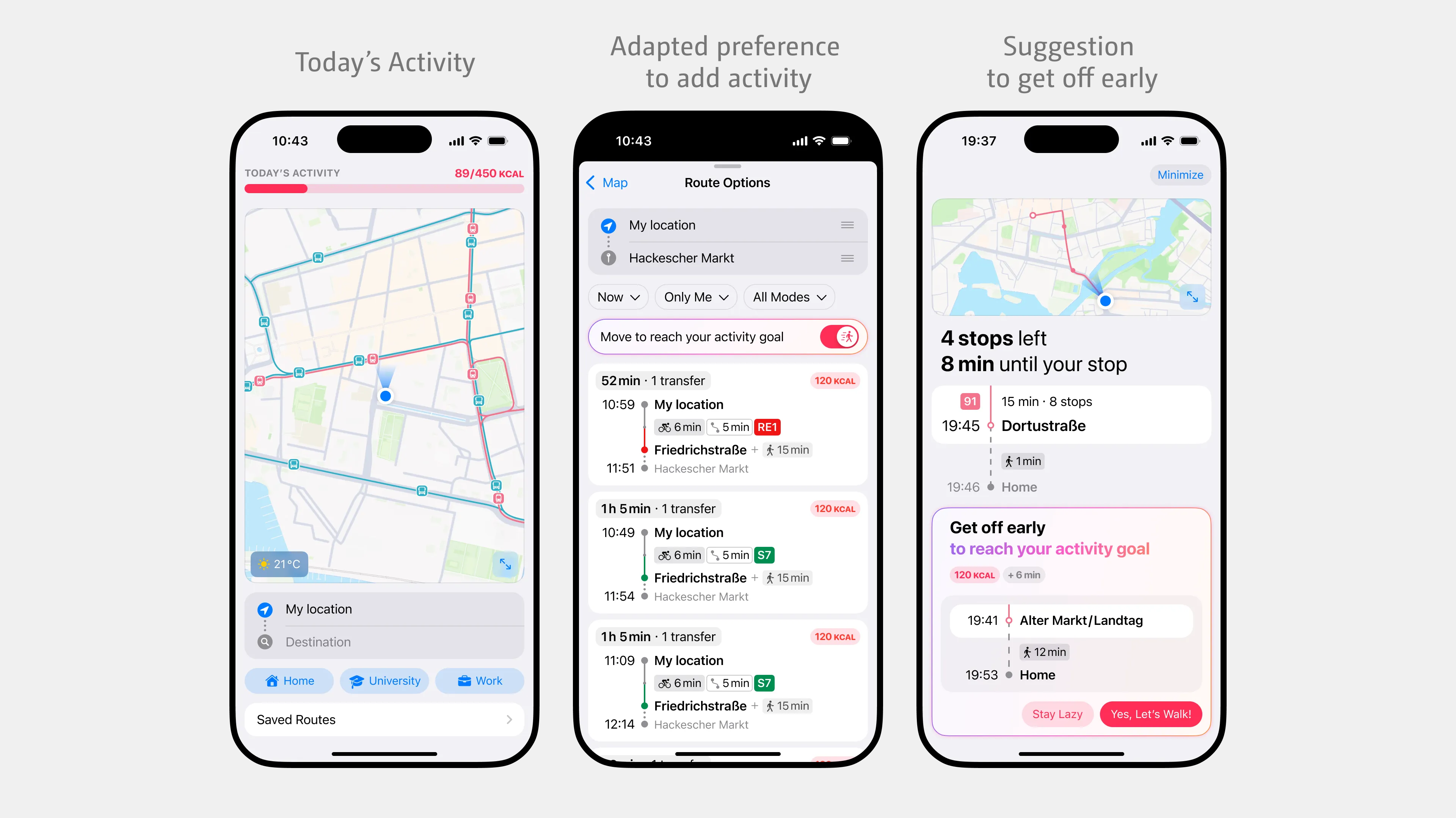
Improve Fitness
As users go about their daily routines, the system helps them reach their activity goals, supporting their overall fitness and health. When users wear wearable devices or allow health apps to track their activity, that activity is considered within the app. If the user has not yet met their daily activity goal, the system will automatically adjust the route preferences to include more walking or cycling, even if the user has not explicitly chosen a more active route at that moment. However, users can opt out of this setting.
In a similar way, when the user nears their final destination, the system may suggest getting off one or two stops early to increase their step count and help them reach their daily activity goal.
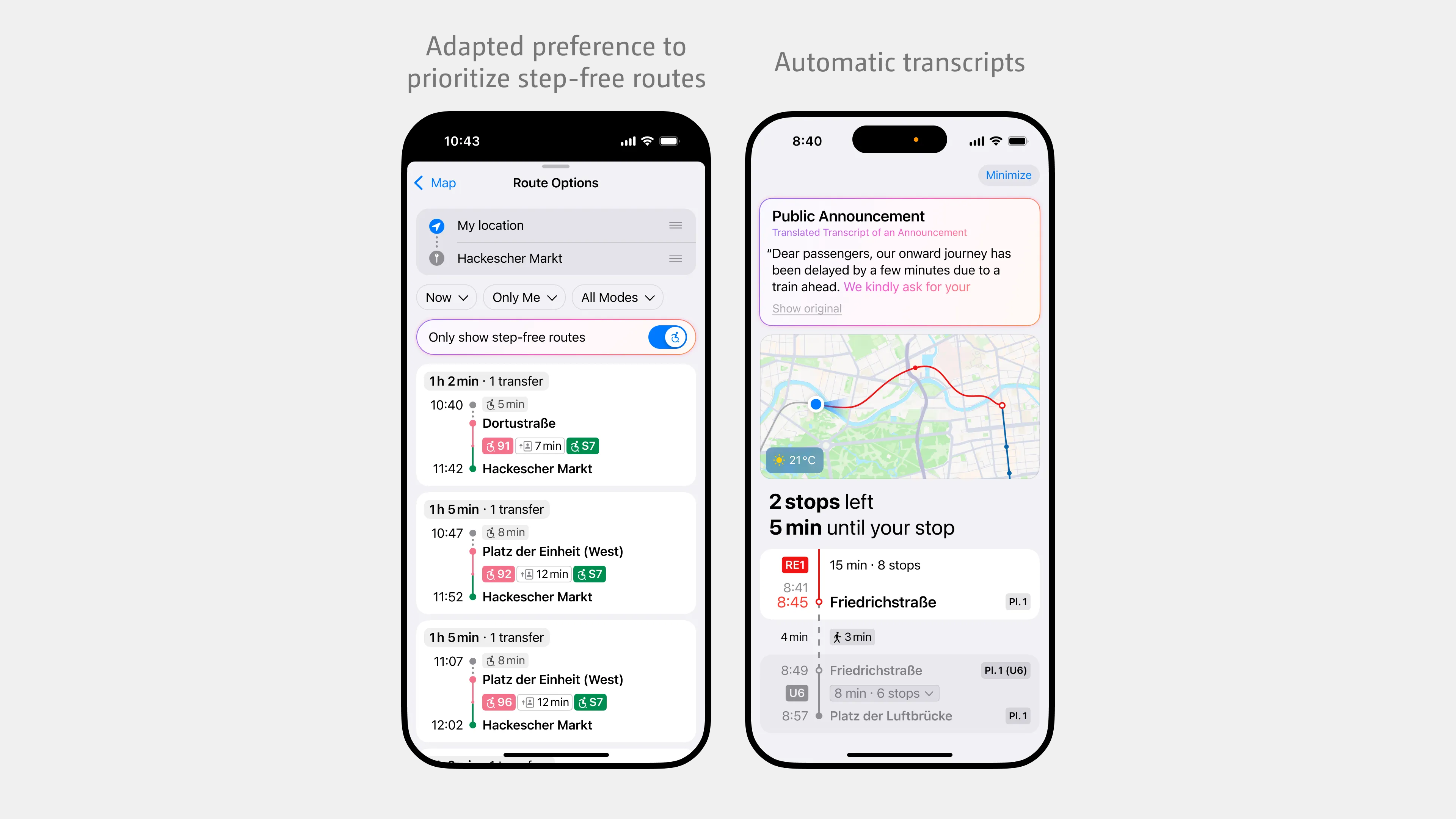
Physical Impairments and Disabilities
If a user’s health record indicates an inability to walk, the system automatically prioritizes step-free routes, although the user can opt out if desired. The accessibility of these routes is communicated through icons that indicate step-free boarding and elevators to the platforms.
Automatic transcripts improve accessibility not only for those with hearing impairments, but also for those wearing headphones. If they are transcribed, they also benefit everyone who does not speak the languages used in the announcements.
relevant factors for a good ux
Adaptivity isn’t just about what the system does—it’s also about how it makes the user feel.
Historically, adaptive user interfaces have struggled to gain widespread user acceptance. Although personalized, context-aware systems show promise, their success depends on how users experience and interact with them. Poorly implemented adaptations can lead to confusion, a sense of loss of control and distrust, all of which have a negative impact on usability and user acceptance. User satisfaction is influenced by many factors and cannot be attributed solely to high recommendation accuracy.
In my research, I identified eight key factors that influence the user experience in adaptive systems. I have summarized them into three core user need:
→ Adaptivity should support, without getting in the way
Users needs to be able to interact with the interface without much effort. It should make it easy for the user to feel confident in their decisions. When an adaptive system supports someone in completing a task, they feel more competent—and are more likely to perceive the system as useful.
But that usefulness is fragile. If a system changes something automatically—without warning—it can feel intrusive or even disorienting. Fully automatic changes tend to be more disruptive than strategies that give users a choice, like a simple recommendation that the user can choose to ignore.

How intrusive something feels depends not just on the system, but on the user’s current state: Are they busy? Are they stressed? Are they trying to get somewhere fast? People are more open to assistance when they’re overwhelmed—and more resistant when their workload is low. So what feels helpful in one moment might feel frustrating in another.
→ Adaptive systems need to gain the user’s trust
Users also need to be able to trust adaptive systems. For users to accept suggestions, the system needs to be accurate, reliable, and responsive to context. If suggestions are off, or feel irrelevant, people stop listening. They dismiss the system—or worse, find it intrusive. But even a system that is reliable isn’t enough on its own. Users also want to understand why the system is doing what it’s doing. That’s where transparency comes in. When we show just enough of the logic behind a suggestion—like “You usually cycle when the weather is good”—we help users feel informed, not manipulated.
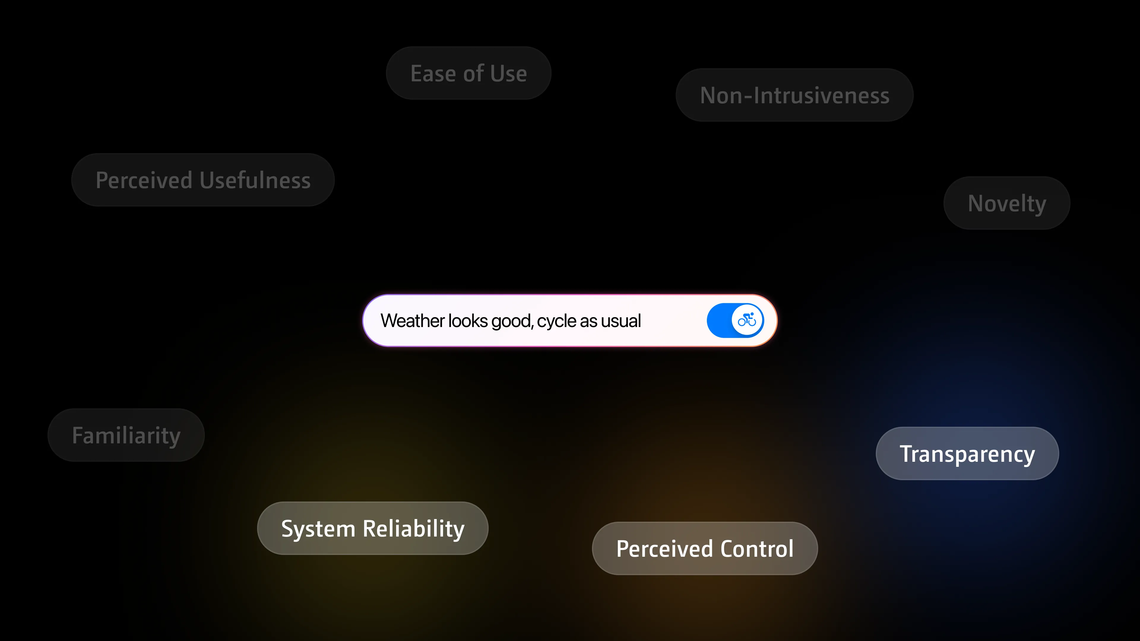
The design challenge is to explain just enough—without disrupting the user’s focus or flooding them with logic. But trust doesn’t only come from the reliability and transparency. It also comes from the user’s own sense of control. Humans want to feel competent, capable, and in charge. When users perceive that they have control, they are more likely to engage. Small design decisions like customization options, clear feedback and giving users the ability to decide for themselves, for example by opting in or out, help to preserve their autonomy. People actually often prefer systems that let them explore, learn, and grow.

Adaptivity isn’t about doing everything for the user. It’s about doing just enough to support them—and letting them take it from there.
→ Adaptivity should feel familiar but also exciting
Lastly, adaptivity should feel familiar. Users tend to prefer interfaces that align with their past experiences—because familiarity builds trust. We’ve all gotten used to certain patterns in modern UI, but adaptive systems don’t always follow fixed patterns—they change. If that change feels too sudden—or too different from what the user expects—it can cause confusion or even break trust. That’s why adaptive interfaces must balance change with consistency. A familiar, recognizable structure reduces the user’s cognitive load and helps them orient themselves. But good adaptive systems know when to introduce something new—like an evolved transfer view, when you have already taken a route a couple of times. At first, it gives the user a direction to platform and then changes into displaying information about the connection.

Novelty keeps an adaptive system valuable over time. The challenge isn’t avoiding change—it’s making sure change feels meaningful.